AI Platform
UX Design
10 min

About DocXter
DocXter is renowned AI-powered platform designed to help users interact with and extract insights from any document. Users upload documents (such as contracts, reports, or research papers) and query them in natural language to receive clear summaries, answers, simplifications, comparisons, and explanations.
My Role
UX Designer
Tools
Figma, Figjam,
Microsoft Clarity
Team Member
2 Designer, 1 PM and Development Team
New User Growth and Scale
12,000+
Average Engagement Time
7m 11s
Overall Performance Improvement
63%
01. What I noticed
Before I open Figma, I spend time just watching user sessions.
Session recordings showed the same pattern repeating. Users would arrive at the uploading process, slow down, hover over settings, reread labels. Then many of them left without uploading anything.
That kind of drop-off is specific. It doesn't mean the product is broken. It means the entry point is wrong.


02. Breaking it down
Problem 01 - The sequence was inverted
Before a file could be uploaded, users had to select a Persona Agent, choose an AI model, and configure OCR settings. These are valid decisions. But they're meaningless until you've seen the product work.
We were asking users to understand the system before experiencing it.

Every decision came before the one thing that would have made those decisions easy, seeing the document.
Problem 02 - Processing held users hostage.
After upload: a spinner. Just wait.
For large files, that wait was long enough to break the experience entirely. The backend wasn't necessarily slow. But users were frozen in place with nothing to do — and that felt slow. Perceived speed is always a design problem. We hadn't treated it like one yet.
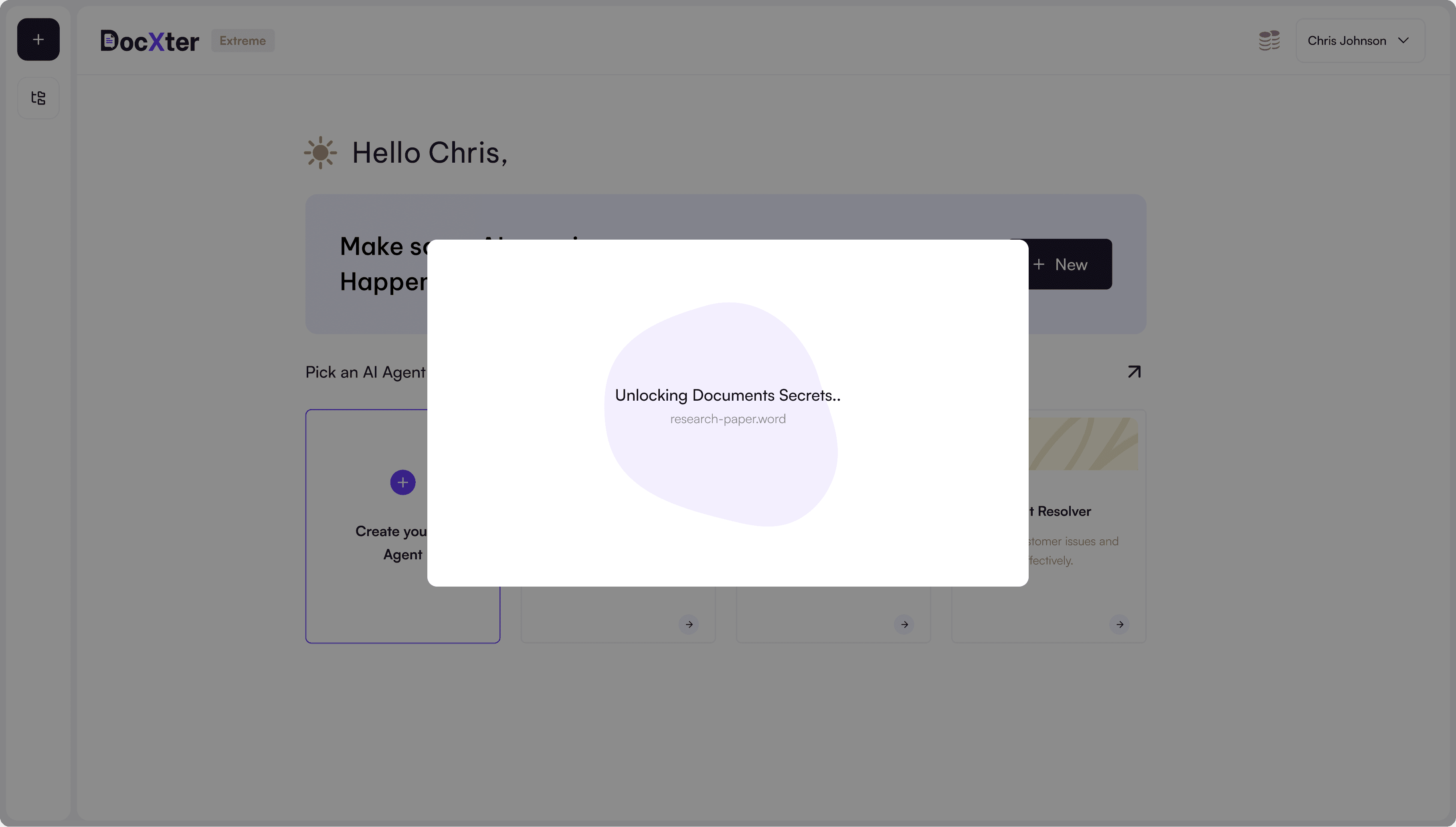
*That kind of friction is telling. It doesn't mean the product is bad. It means the entry point is wrong.
Problem 03 - We were collecting data nobody used
The onboarding asked users to identify as Student or Professional and provide their institution name before they'd seen anything.
During a cross-functional review, I asked Marketing directly: "Are we actually using this to personalize anything — drip campaigns, content, features?"
The answer was no.
Those fields disappeared immediately. No lighter version. No replacement. Just gone.
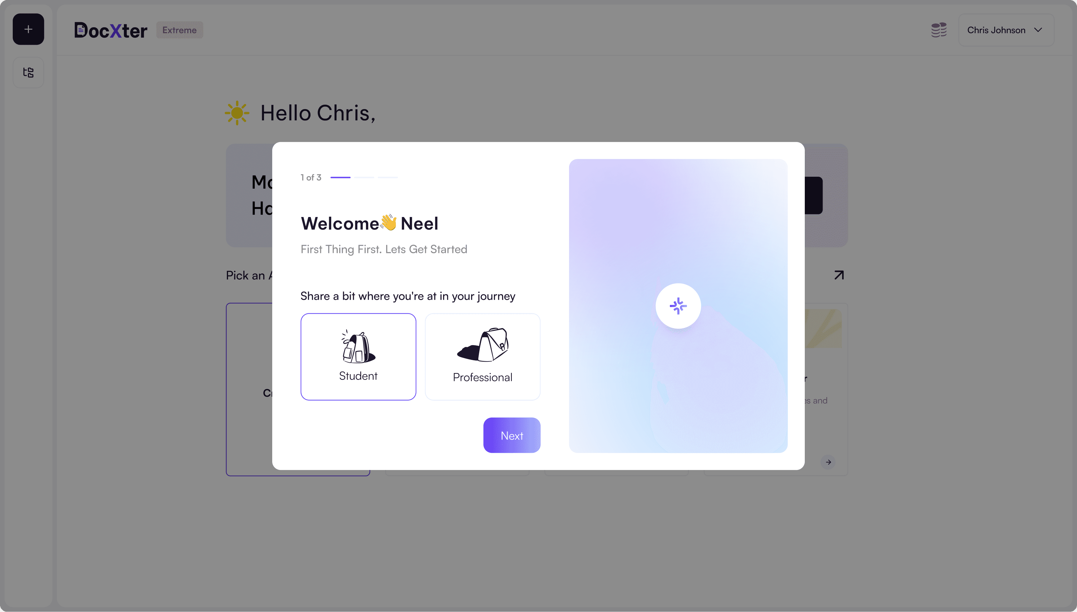
*We removed it. No replacement. No lighter version. Just gone.
03. The line Changed Everything
Making friction look better
isn't the same as reducing it.
My first instinct was a step-by-step configuration flow. Break the decisions into smaller stages. Show progress. Guide users through each choice one at a time.
I sketched it. Prototyped it. Ran an internal walkthrough.
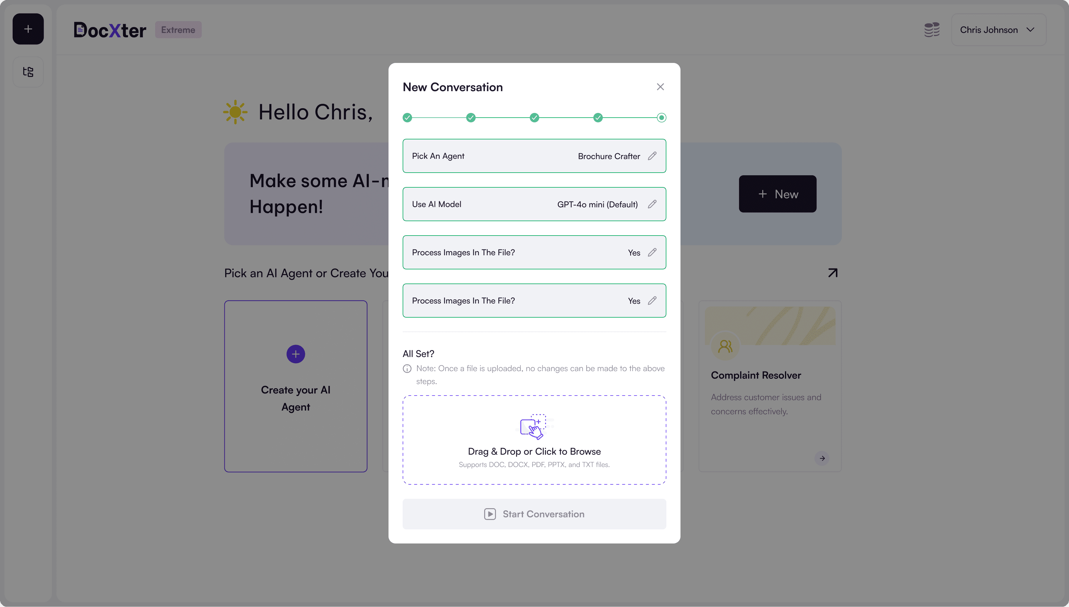
*Making friction look better isn't the same as reducing it.
First instinct: break the configuration into smaller steps.
Still a barrier. Just a better-looking one.
Does a user have enough clarity about their document to make meaningful decisions before they've even uploaded it?
The answer was obvious once I said it out loud.
04. The Solutions
Solution 01 - Upload First
One sequence change. Everything followed from it.
Users uploaded their document first. Got a preview of what they were working with. Then configured — with full context. Every subsequent decision became faster, more intentional, more accurate. They weren't guessing anymore. They knew their document. They knew their task.

*They chose with context now. Not guesswork.
Screen 01 - New upload screen
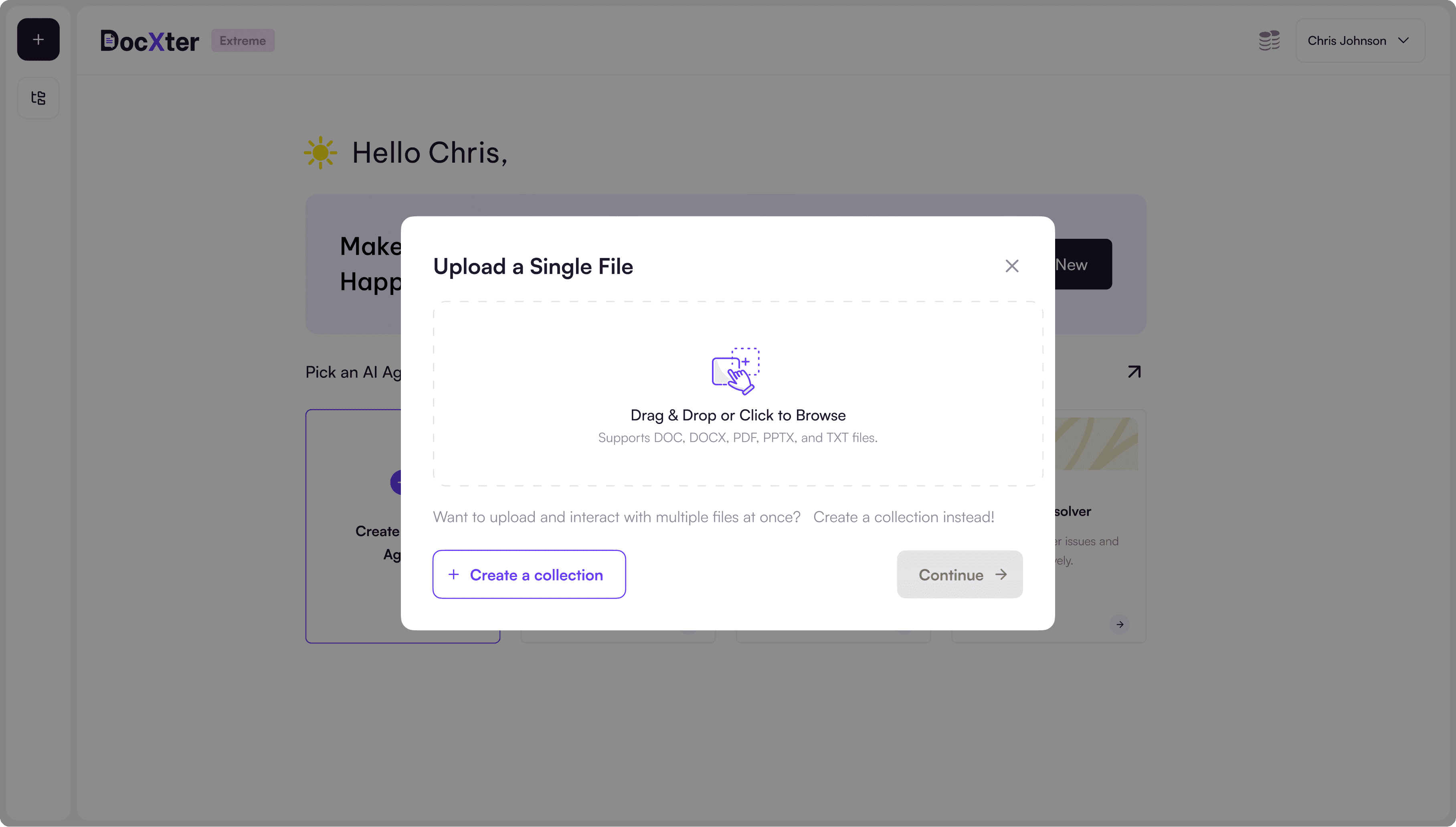
*New step one: Upload your document.
Screen 02 - Document preview state with configuration screen post-upload

*Now the user knows what they're working with. Same decisions as before. Completely different experience.
Before
100 users started onboarding
→
62 abandoned before upload
After
100 users started onboarding
→
14 abandoned before upload
↓ 90% reduction in first-session abandonment
Solution 02 - The Knowledge Base
Once upload was decoupled from configuration, something else became possible.
Processing didn't need to block the user at all.
A dedicated space for users to manage documents separately from the chat interface. Drop a file in, let it process in the background, continue exploring the product. When processing finishes, the document is ready.
Screen 02 - Document preview state with configuration screen post-upload

*A dedicated space for documents to process independently. User continues exploring. Document gets ready.
Solution 03 - Model Selection Made Human
Before, there was just dropdown with all listed AI model. Then one variation model selector was a data dump.
It listed every available LLM with token limits, context windows, API pricing, and version numbers. Technically complete. Wrong audience. Users had to make a choice with real consequences — it affected their results and their credits — but the interface gave them nothing to make that choice with. Most people either selected randomly or froze entirely.
The redesign translated technical metrics into human decisions:
Screen 02 - Document preview state with configuration screen post-upload

*Language the user actually speaks. The users will understand.
Users stopped selecting randomly. Support requests related to model selection decreased significantly. Model configuration — previously a source of anxiety — became a moment of confidence.
05. What it Became
The first-use experience went from friction to momentum.
Users no longer needed to understand the system to begin. They could start immediately, see value quickly, and deepen engagement over time — revealing complexity only as they needed it, only when they had context to use it.
Problem
Design Change
Behavioral Outcome
Users abandoned upload flow
Upload before configuration
Reduced onboarding abandonment
Users froze during processing
Async knowledge base
Increased engagement duration
Users guessed AI models
Human-readable model cards
Higher model selection confidence
Reduction in onboarding abandonment
90%
Average Engagement Time
7m 11s
Faster document processing
49%
Overall performance improvement
63%
06. What I Carry Forward
Sequencing shapes experience more than features.
Our biggest improvement didn't come from adding something new. It came from changing the order of what already existed. A complicated system became an intuitive one — not because we simplified it, but because we introduced complexity at the right moment.
Perceived speed is always a design problem.
Before assuming the backend needs to change, ask whether users are being made to feel the wait unnecessarily. The Knowledge Base didn't make processing faster. It made waiting disappear.
Removing is a design decision too.
The onboarding fields we deleted weren't replaced with something lighter. They were just gone. Sometimes the right answer isn't a better version of what exists — it's the absence of it entirely.
Next Project